Collection · 8 fonts

8 graffiti fonts that actually cut clean on a Cricut or Silhouette

Picked by Selene Rocheline · 2026-08-04

Most graffiti fonts are a bad idea on a cutting machine, and the reason is simple. The things that make the style look good — spray texture, rough edges, drips, speckles — are hundreds of tiny separate shapes, and a blade has to travel around every one of them. The result is torn vinyl, a shredded mat and half an hour of weeding for a word you could have cut in four minutes.

What you want instead is an alphabet with smooth closed paths and no interior noise. These eight are the ones I reach for when something has to be cut rather than printed. As a general rule, weed a test word before committing to a full sheet, and bump the blade pressure down rather than up if the corners start lifting.
  1. Vector Sharp Graffiti Font letters shown on a sample sheet

    Vector Sharp Graffiti Font

    The cleanest cut in the whole collection. Every curve is mathematically smooth and every corner is exact, which is precisely what cutting software wants. If you only try one from this list, make it this one.

    Download Full write-up →
  2. Clean Line Graffiti Font letters shown on a sample sheet

    Clean Line Graffiti Font

    Single-weight lines with no fill at all. It cuts fast because there is so little path to follow, and it works for single-line plotter drawing as well as vinyl.

    Download Full write-up →
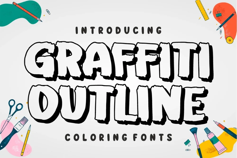
  3. Hollow Outline Graffiti Font letters shown on a sample sheet

    Hollow Outline Graffiti Font

    Outlines only, which means you can cut the outline in one colour of vinyl and the fill in another, then layer them. Two passes, but the result looks like a proper painted piece.

    Download Full write-up →
  4. Line Vandal Outline Font letters shown on a sample sheet

    Line Vandal Outline Font

    A thinner, more angular outline. The narrow stroke is the one thing to watch — go below about fifteen millimetres of letter height and the thin sections get fragile when you weed them.

    Download Full write-up →
  5. Blackout Graffiti Display Font letters shown on a sample sheet

    Blackout Graffiti Display Font

    Solid, stencil-like silhouettes with almost no curves. It weeds faster than anything else here because there is so little to pick out, and it holds up on stretchy fabric.

    Download Full write-up →
  6. Block House Graffiti Font letters shown on a sample sheet

    Block House Graffiti Font

    Straight sides and right angles throughout. Flat planes are the easiest thing a blade can follow, so this is the reliable choice for large signage where a torn corner means starting over.

    Download Full write-up →
  7. Heavy Weight Graffiti Alphabet letters shown on a sample sheet

    Heavy Weight Graffiti Alphabet

    Dense and tight-spaced. The enclosed sections inside letters are small, so keep an eye on them at little sizes — but for big statement cuts on a wall or a window it is excellent.

    Download Full write-up →
  8. Sharp Marker Graffiti Alphabet letters shown on a sample sheet

    Sharp Marker Graffiti Alphabet

    Even stroke width and clean pointed terminals. Those points are the only fussy part; round them very slightly in your design software if the blade keeps overshooting.

    Download Full write-up →

One habit worth building: before you cut anything from this list, select the text and convert it to outlines or a shape. Cutting software sometimes substitutes a different font when a file moves between machines, and outlined shapes cannot be substituted.

Take the whole list for nothing

The first ten downloads cost nothing, which covers most of this collection outright. No payment is needed to start and you can stop whenever you like.

Open the library Your first 10 downloads are free — no payment to start.

More collections

← All collections and articles