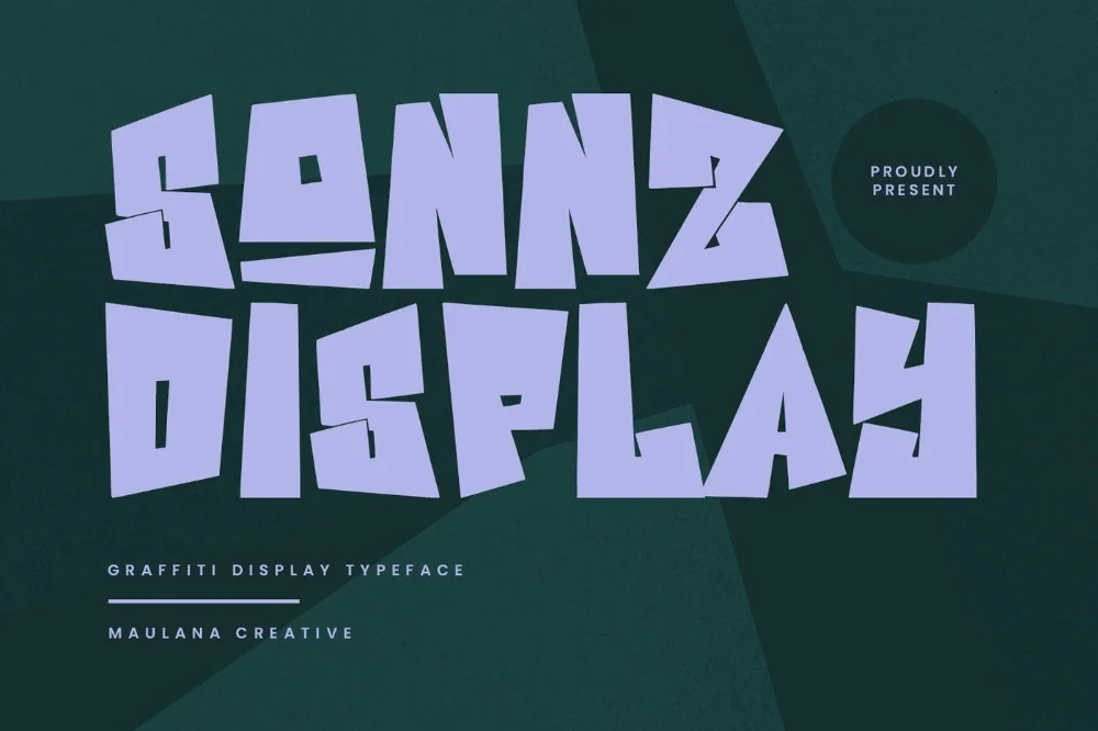
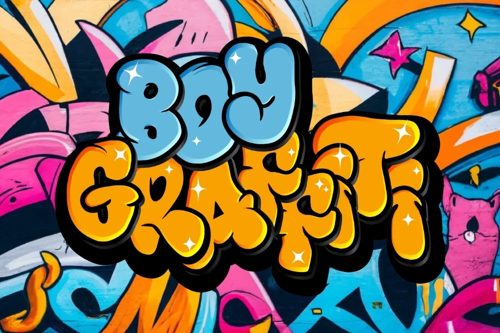
Collection · 9 fonts

9 bold graffiti fonts for t-shirt designs that hold up in print

Picked by Selene Rocheline · 2026-08-10

A print-on-demand listing lives or dies as a thumbnail. Someone scrolling sees your design at about the size of a postage stamp, and if the lettering turns to mush at that scale they never click through to see the full thing. The second problem is fabric: fine detail closes up when ink soaks into a knit, and the enclosed parts of letters fill in solid.

These nine survive both. They are heavy enough to read tiny, open enough not to clog, and every one of them carries a commercial licence so a finished design can actually go on sale. Set your artwork at about four centimetres wide on screen before you upload — that is roughly what a buyer sees in a browse grid.
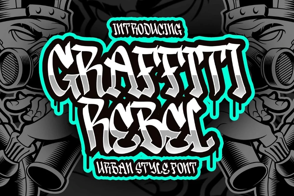
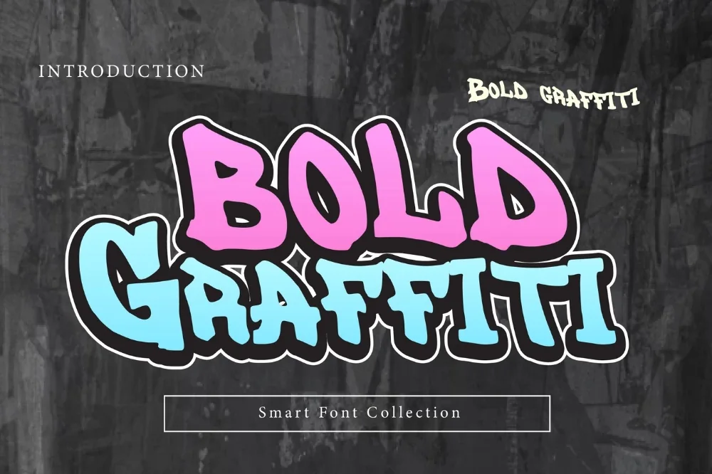
  1. Street Riot Graffiti Font letters shown on a sample sheet

    Street Riot Graffiti Font

    Loud, wall-sized letterforms that lean into each other. Short words read as a single unbroken burst, which is exactly what you want across a chest print.

    Download Full write-up →
  2. Heavy Weight Graffiti Alphabet letters shown on a sample sheet

    Heavy Weight Graffiti Alphabet

    The densest alphabet here. Tight spacing and wide stems mean a word reads as one solid mass of colour, and it holds together at thumbnail size better than anything else on this list.

    Download Full write-up →
  3. Blackout Graffiti Display Font letters shown on a sample sheet

    Blackout Graffiti Display Font

    Stencil-like flat silhouettes. It reverses out of a black shirt without any of the fill-in problems that catch finer faces, so it works for both light and dark garments.

    Download Full write-up →
  4. Hype Street Poster Font letters shown on a sample sheet

    Hype Street Poster Font

    Wide stems and blunt terminals, built to be read from a distance. Very little detail to lose, which makes it forgiving of cheap printing.

    Download Full write-up →
  5. Street Hype Headline Font letters shown on a sample sheet

    Street Hype Headline Font

    Compressed capitals that fit a long slogan across a chest without shrinking the type. If your design is words rather than a shape, this is the one that lets you say more.

    Download Full write-up →
  6. Impact Blast Graffiti Font letters shown on a sample sheet

    Impact Blast Graffiti Font

    Jagged, explosive shapes for a single loud word. Give it space — it forms a starburst rather than a rectangle, and crowding it against other elements wastes the effect.

    Download Full write-up →
  7. Wall Display Graffiti Font letters shown on a sample sheet

    Wall Display Graffiti Font

    Mural proportions: wide stems, open counters, no texture. It was drawn to be seen from across a room, which translates neatly to a back print.

    Download Full write-up →
  8. Young Crew Graffiti Font letters shown on a sample sheet

    Young Crew Graffiti Font

    Rounded and evenly weighted, aimed at a younger buyer. The generous spacing is what makes it forgiving on stretchy fabric like a child's tee.

    Download Full write-up →
  9. Block House Graffiti Font letters shown on a sample sheet

    Block House Graffiti Font

    Flat planes and right angles. The most structured option here, and a good base when the design needs the lettering to sit quietly behind a graphic rather than compete with it.

    Download Full write-up →

Before you list anything, check the design in greyscale. If the letters vanish when the colour comes out, the tonal range is too narrow and it will look muddy on every garment colour except the one you designed it on.

Take the whole list for nothing

The first ten downloads cost nothing, which covers most of this collection outright. No payment is needed to start and you can stop whenever you like.

Open the library Your first 10 downloads are free — no payment to start.

More collections

← All collections and articles