Collection · 6 fonts

6 chrome and shine graffiti fonts for album covers and music artwork

Picked by Selene Rocheline · 2026-08-13

Chrome lettering is one of the oldest tricks in this genre and still one of the hardest to fake convincingly. Done by hand it takes four layers and a good eye for where the light falls; get the highlight on the wrong side of a stroke and the whole thing reads as flat and slightly wrong.

These six have the highlight drawn in already, consistently, on the same side of every letter. All of them work best on a dark background, where the bright shapes have something to push against. On white they lose about half their effect, so plan the background before you plan the type.
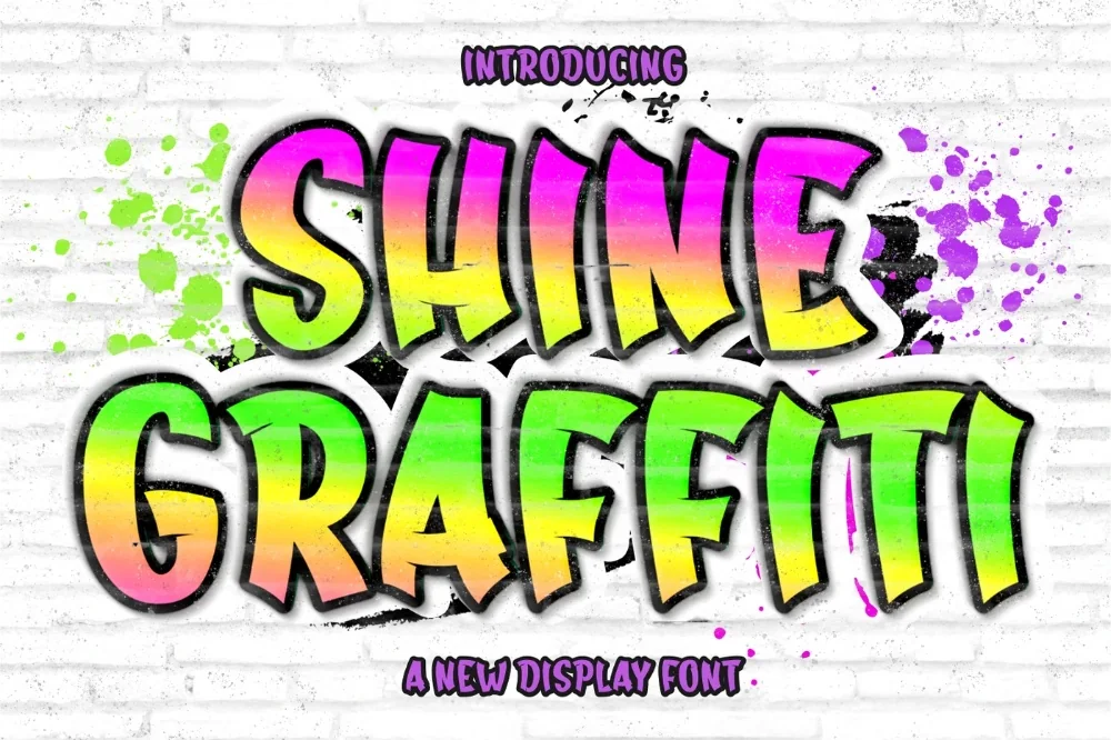
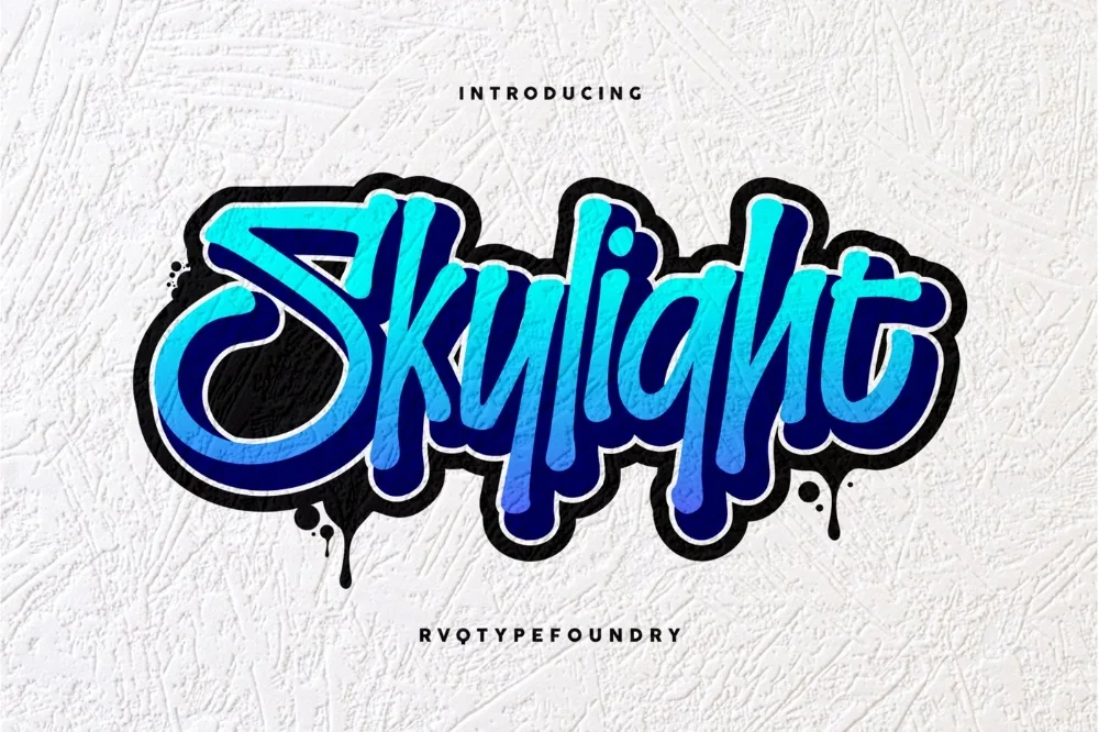
  1. Chrome Shine Graffiti Font letters shown on a sample sheet

    Chrome Shine Graffiti Font

    Full chrome: white highlight shapes along the top of each stroke with darker bands beneath. It is the most literal interpretation here and the most effective on a black cover.

    Download Full write-up →
  2. Skyline Chrome Display Font letters shown on a sample sheet

    Skyline Chrome Display Font

    Narrow and upright, with the highlight cut back to a single thin line. That restraint is what lets you set a whole title rather than one word without it becoming exhausting to look at.

    Download Full write-up →
  3. Drop Shadow Street Font letters shown on a sample sheet

    Drop Shadow Street Font

    A hard offset shadow behind every letter, at a consistent distance. It gives you depth without any layering work, and it lifts a title off a busy photograph.

    Download Full write-up →
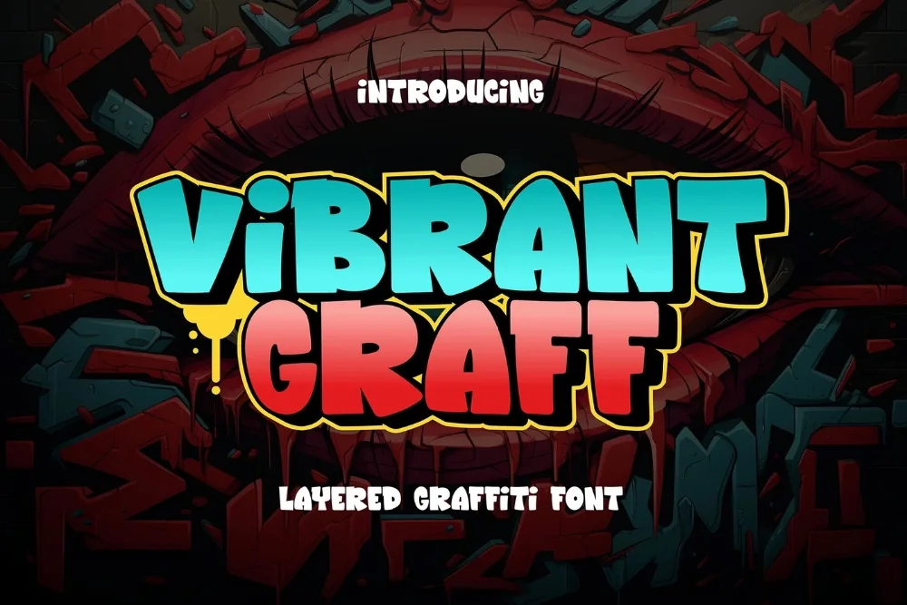
  4. Vibrant Color Pop Graffiti Font letters shown on a sample sheet

    Vibrant Color Pop Graffiti Font

    Built as separate layers for fill, outline and offset, so you can colour each independently. More work than the others, and the only one here that gets you a genuine multi-colour piece.

    Download Full write-up →
  5. Sound System Street Font letters shown on a sample sheet

    Sound System Street Font

    Wide squared letters with horizontal cut lines through the stems, echoing speaker grilles. Set tight, a title reads like a stack of cabinets — made for anything with bass in it.

    Download Full write-up →
  6. Star Crew Graffiti Font letters shown on a sample sheet

    Star Crew Graffiti Font

    Bold shapes with star cut-outs and highlight accents. Less metallic than the rest, but it hits the same celebratory register and works well for single artwork and promo tiles.

    Download Full write-up →

One practical note for streaming platforms: your cover gets displayed at around three hundred pixels square in most apps. Set the title as large as the layout will tolerate, because the chrome detail is the first thing to disappear when the image is scaled down.

Take the whole list for nothing

The first ten downloads cost nothing, which covers most of this collection outright. No payment is needed to start and you can stop whenever you like.

Open the library Your first 10 downloads are free — no payment to start.

More collections

← All collections and articles