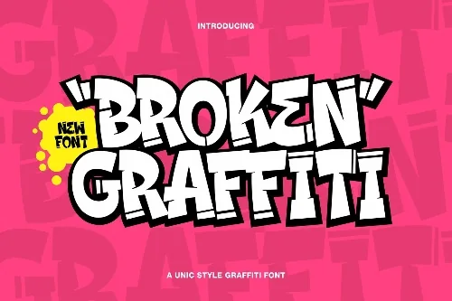
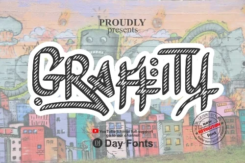
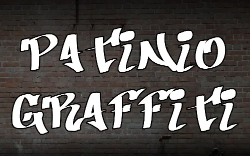
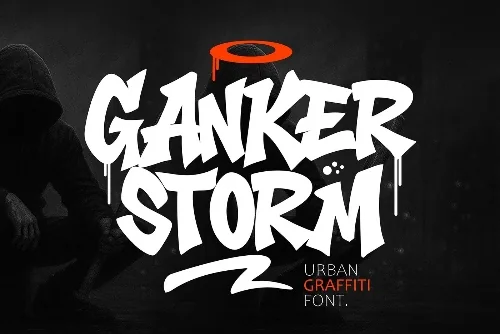
Skyline Chrome Display Font
Artwork by Skylight 3, the original creator of this set.
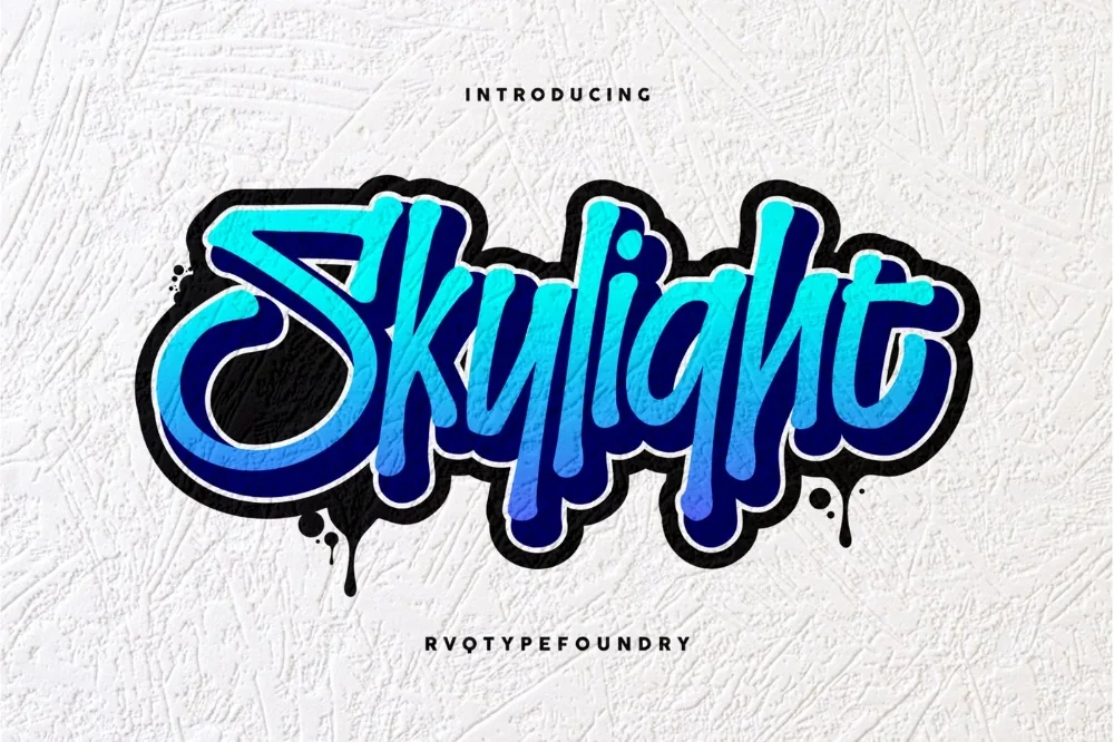
Download this fontAffiliate link
Some links below are affiliate links — a small commission may come back to me at no extra cost to you. More on this.
This chrome lettering font was picked for the collection because it solves a problem the obvious choices do not. Tall, upright letters with a slim metallic sheen. More restrained than full chrome, and easier to read in long lines.
The proportions are noticeably narrow and vertical, and the highlight is reduced to a single thin line rather than a full band. That keeps whole sentences readable while still reading as metal.
Suits event titles, magazine-style headlines, and stacked poster layouts with limited width.
You get desktop-ready font files that install in seconds. If a program was already open when you installed, close and reopen it — fonts are only loaded at startup. The commercial licence included covers finished designs you sell, which is what most projects need. Passing on the font file itself is a different permission and is not included.
Worth knowing: tighten the letter spacing well past what feels comfortable. Painted lettering is set tight, and default digital spacing makes this genre look oddly polite.
Open the full listing to see the complete character set and the designer behind it.
Get Skyline Chrome Display FontAffiliate link
Your first 10 downloads are free — no payment to start.