Collection · 8 fonts

8 marker and tag fonts for journal pages, zines and blackbook spreads

Picked by Selene Rocheline · 2026-08-16

Most graffiti fonts are headline voices. Ask them to carry a paragraph and they collapse, because the things that make a tag exciting — overlaps, extreme angles, wild baselines — are the same things that make running text exhausting to read.

These eight sit at the readable end of the genre. They keep the hand-drawn quality but hold a steadier baseline and more consistent spacing, which means you can use them for captions, annotations and short paragraphs rather than just for a title. They are the ones I use when a page needs to look handmade all over rather than typed with one shouty heading.
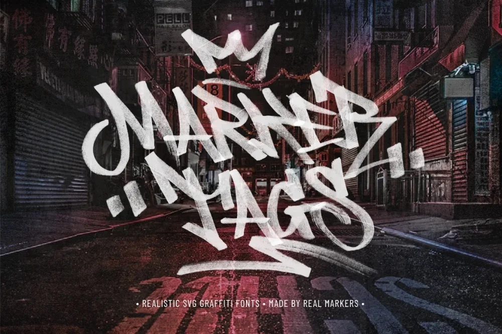
  1. Handheld Marker Tag Font letters shown on a sample sheet

    Handheld Marker Tag Font

    Chisel-tip marker with thick verticals and thin horizontals. That built-in contrast gives even short words a rhythm, and it stays compact enough for labels and margin notes.

    Download Full write-up →
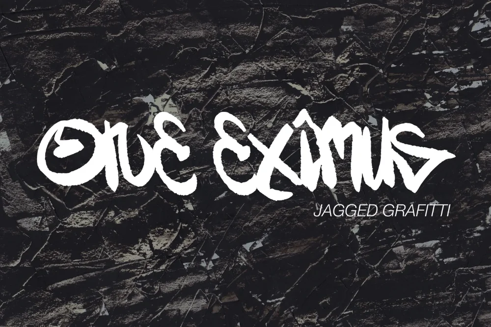
  2. Sharp Marker Graffiti Alphabet letters shown on a sample sheet

    Sharp Marker Graffiti Alphabet

    More disciplined than most tag styles: even stroke width, clean points, a steady baseline. It is the one to use when the writing needs to look confident rather than hurried.

    Download Full write-up →
  3. Everyday Marker Tag Font letters shown on a sample sheet

    Everyday Marker Tag Font

    The workhorse. Consistent weight and generous inner space mean full sentences stay comfortable, so it can genuinely carry body text rather than just headings.

    Download Full write-up →
  4. Rapid Tagger Marker Font letters shown on a sample sheet

    Rapid Tagger Marker Font

    Thin, hurried strokes that occasionally overshoot their joins. Set small and repeated, it looks like a wall covered in real tags — ideal as background texture behind cleaner type.

    Download Full write-up →
  5. Freehand Street Tag Font letters shown on a sample sheet

    Freehand Street Tag Font

    Tapering strokes and a deliberately drifting baseline. Letters sit at slightly different angles, so no two words look identical and a page never gets that copy-pasted feeling.

    Download Full write-up →
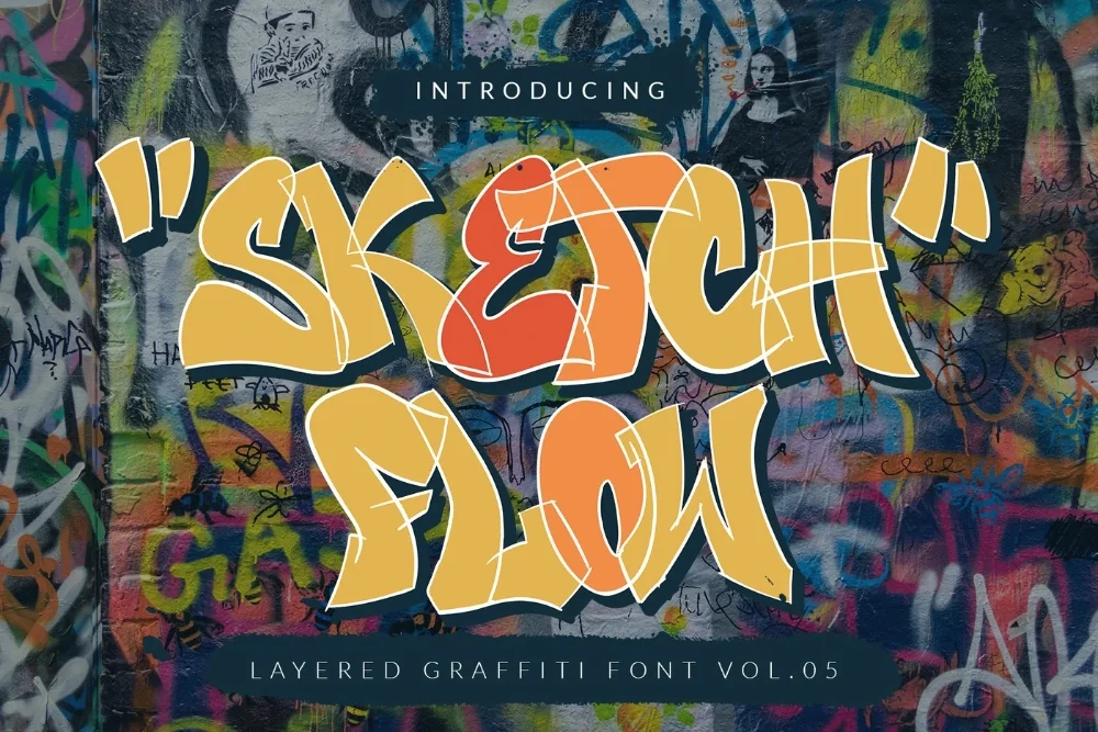
  6. Sketchbook Flow Lettering Font letters shown on a sample sheet

    Sketchbook Flow Lettering Font

    Working lines left in, with faint double strokes where something was redrawn. It looks like a page out of a blackbook, which is either exactly right or entirely wrong depending on your project.

    Download Full write-up →
  7. Vintage Subway Tag Font letters shown on a sample sheet

    Vintage Subway Tag Font

    Round terminals and swelling stems, more felt tip than spray can. Warmer and friendlier than the rest, and the small inconsistencies between repeated letters keep long words alive.

    Download Full write-up →
  8. Angular Throw-Up Font letters shown on a sample sheet

    Angular Throw-Up Font

    Simplified down to a handful of straight edges per letter, the way a throw-up gets painted fast. Rough by design, and a good contrast partner for any of the smoother options above.

    Download Full write-up →

Mix two of these rather than one. A steadier face for the actual text and a scrappier one for headings and marginalia gets you a page that looks hand-built instead of one that looks like a single font doing all the work.

Take the whole list for nothing

The first ten downloads cost nothing, which covers most of this collection outright. No payment is needed to start and you can stop whenever you like.

Open the library Your first 10 downloads are free — no payment to start.

More collections

← All collections and articles