Collection · 7 fonts

7 spray paint and wall texture fonts for poster design

Picked by Selene Rocheline · 2026-08-28

Posters are the one format where texture pays off properly. At A2 or bigger there is enough surface for grain to read as grain rather than as a smudge, and a heavily textured alphabet can carry an entire layout without a single photograph.

These seven have their surface drawn in. That matters more than it sounds: an overlay texture stretches when you scale it and starts to look like a filter, while drawn texture stays exactly as sharp as the letters it belongs to. Everything here is built for large format, and most of it is a poor choice below about forty millimetres of letter height.
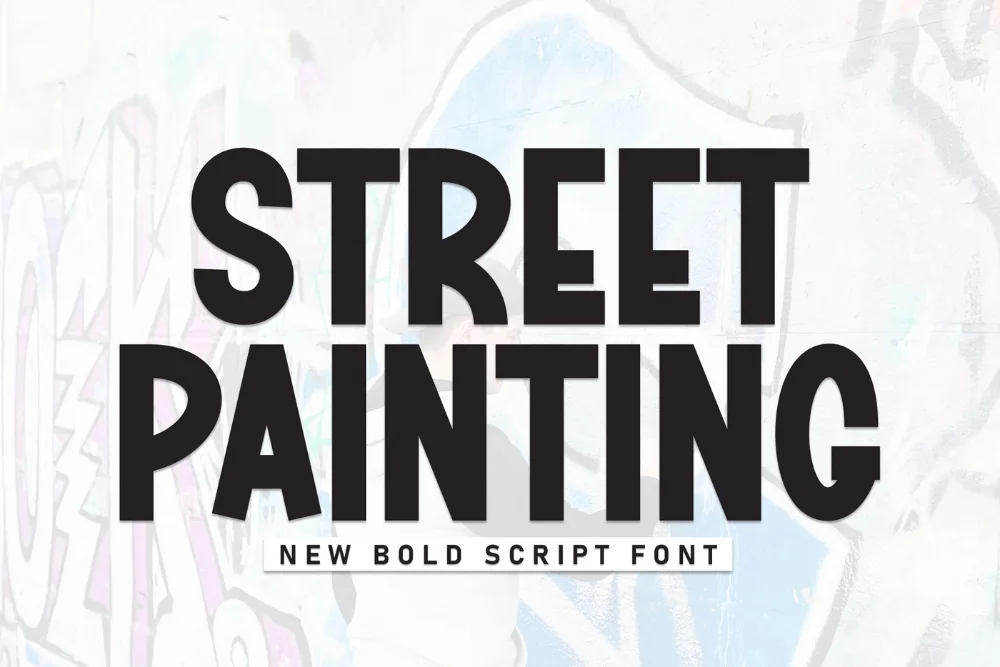
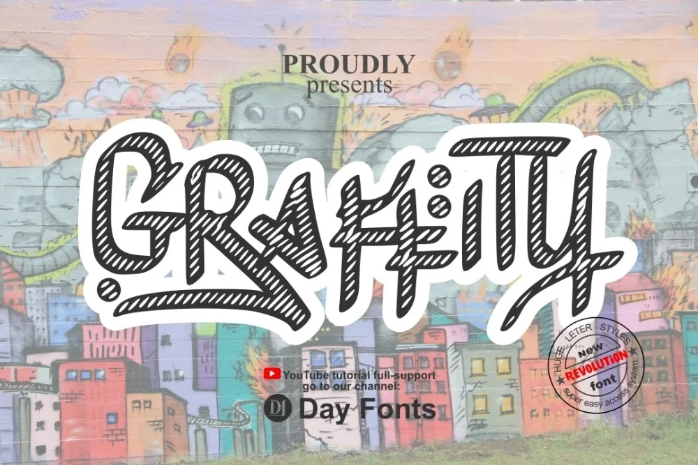
  1. Spray Wall Painting Display Font letters shown on a sample sheet

    Spray Wall Painting Display Font

    Soft edges with light overspray drifting past the strokes, and a few drips near the baseline. It is the closest thing here to actual paint on actual brick.

    Download Full write-up →
  2. Rough Wall Graffiti Font letters shown on a sample sheet

    Rough Wall Graffiti Font

    Wobbling outlines and speckles breaking away from the strokes. The grain becomes more visible the bigger you set it, which makes it a natural fit for large-format work.

    Download Full write-up →
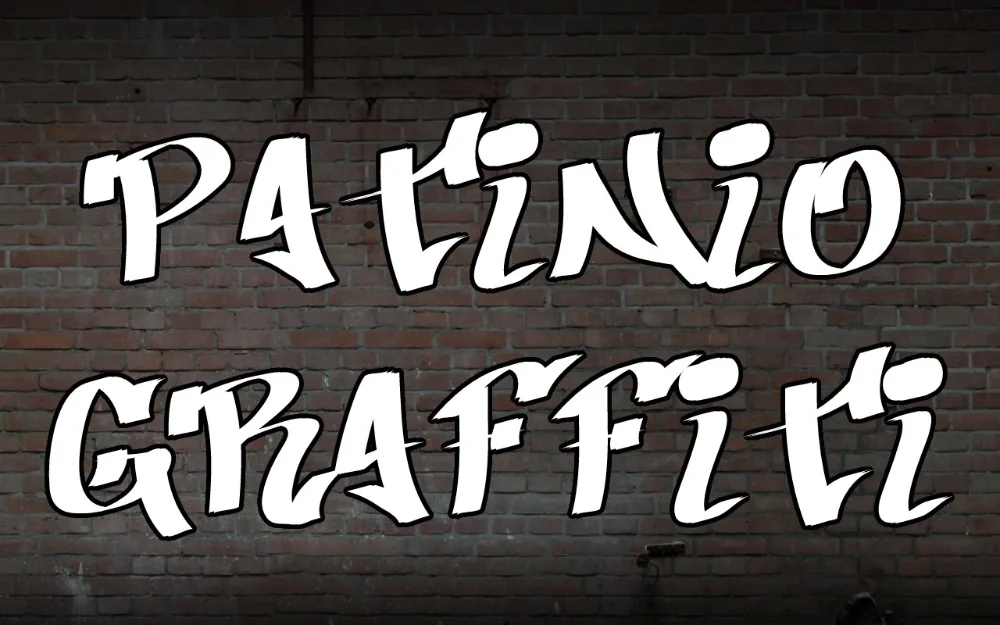
  3. Weathered Patina Street Font letters shown on a sample sheet

    Weathered Patina Street Font

    Fine mottling and unevenly softened edges. Because colour shows through the gaps it layers beautifully over a photograph without needing a blend mode.

    Download Full write-up →
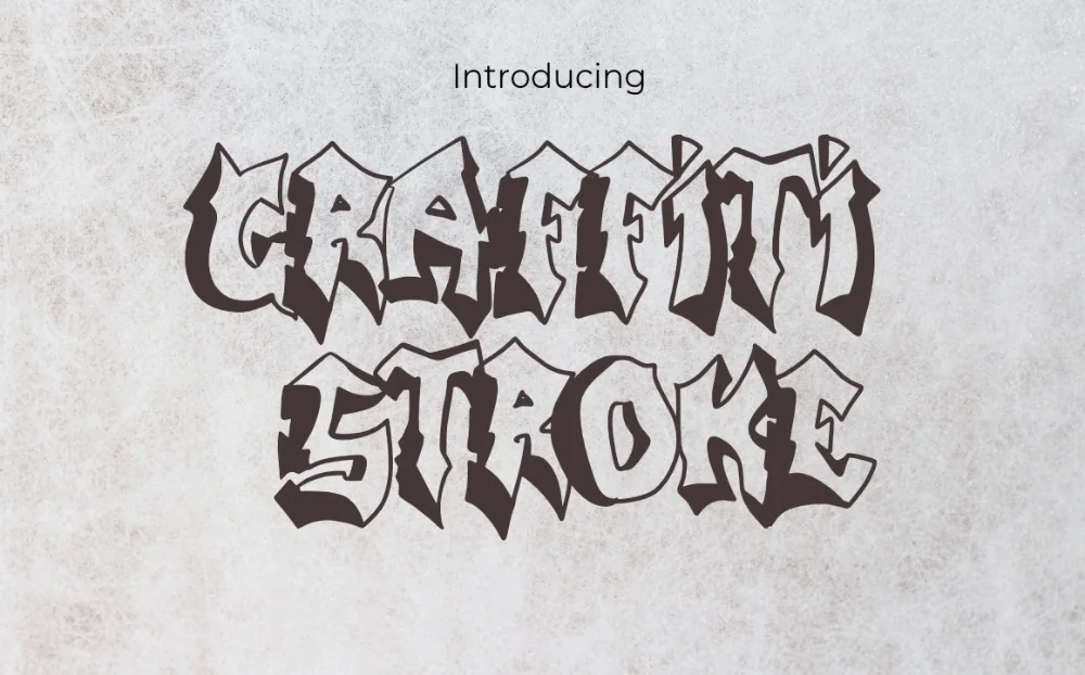
  4. Cracked Concrete Graffiti Font letters shown on a sample sheet

    Cracked Concrete Graffiti Font

    Fractures through the strokes and chips knocked out of the corners. The underlying letters are simple, so the damage reads as texture rather than as noise.

    Download Full write-up →
  5. Broad Stroke Graffiti Font letters shown on a sample sheet

    Broad Stroke Graffiti Font

    Wide brush marks that swell in the middle and taper at both ends, with slight ragged edges from the bristles. Painted rather than sprayed, and warmer for it.

    Download Full write-up →
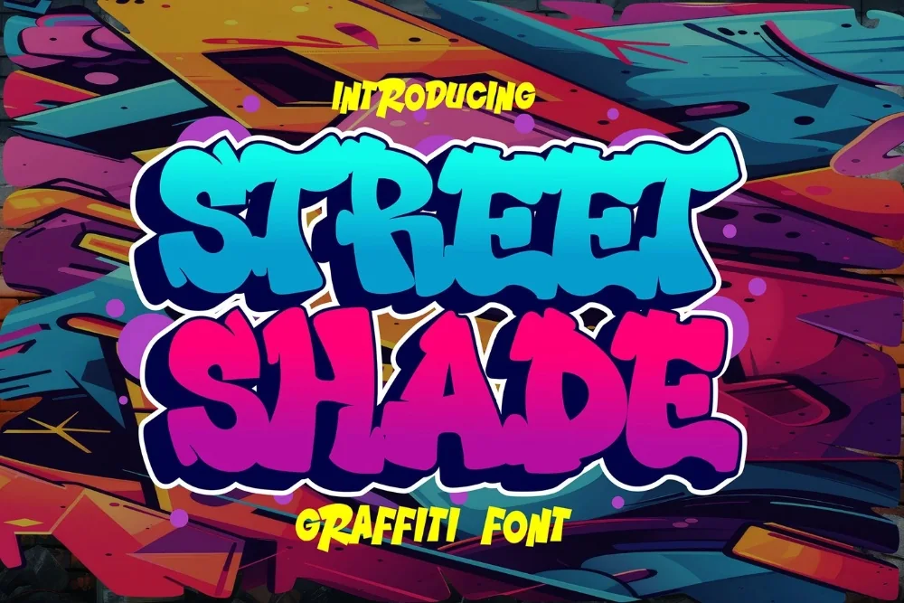
  6. Drop Shadow Street Font letters shown on a sample sheet

    Drop Shadow Street Font

    A hard offset shadow behind every letter. On a poster it is what separates the headline from a busy background, and it costs you no extra layers.

    Download Full write-up →
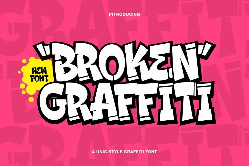
  7. Hype Street Poster Font letters shown on a sample sheet

    Hype Street Poster Font

    Blocky, wide-stemmed and built for pasting up at scale. It has almost no detail to lose at distance, which is exactly what you want on something read from across a street.

    Download Full write-up →

Print a small section at full size before committing to a large run. Textured lettering is the first thing to look wrong on cheap paper stock, and a test strip costs almost nothing compared to a wasted batch of posters.

Take the whole list for nothing

The first ten downloads cost nothing, which covers most of this collection outright. No payment is needed to start and you can stop whenever you like.

Open the library Your first 10 downloads are free — no payment to start.

More collections

← All collections and articles