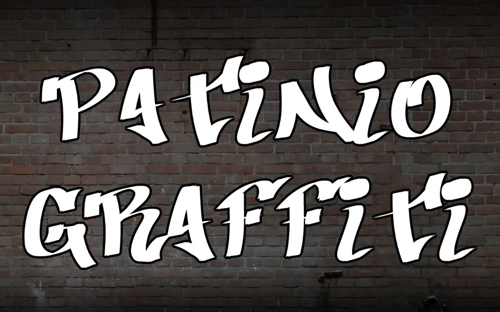
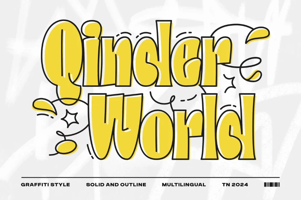
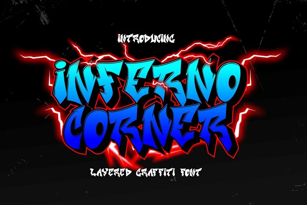
Collection · 7 fonts
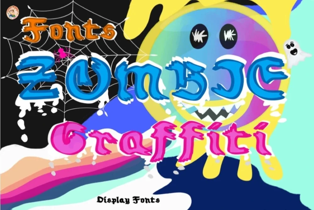
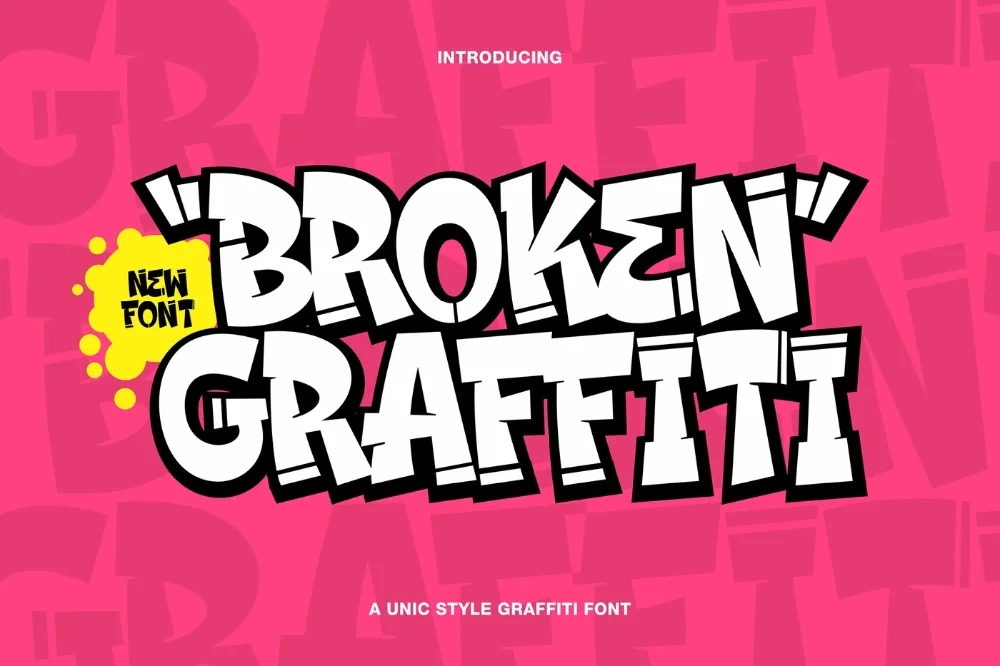
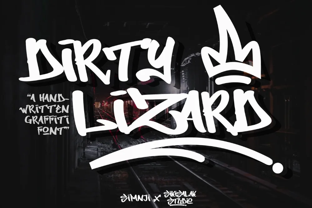
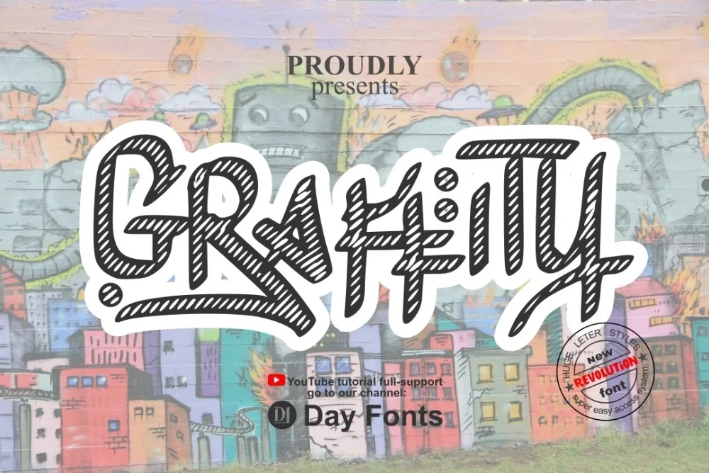
7 drippy, gritty graffiti fonts for Halloween and horror designs
The lazy way to make lettering look sinister is to slap a grunge overlay on top of a clean font. It never quite works, because the texture sits on the surface instead of belonging to the letters, and the edges give it away every time.
These seven have the damage drawn into the letterforms themselves. That means one less layer to manage, and it means the effect survives being resized — an overlay stretches and goes blurry, a drawn drip does not. Between them they cover the full range from lightly weathered to actively rotting, so there is something here whether you are making a horror poster or just want a Halloween tumbler design that does not look like everyone else's.