Subway Car Lettering Alphabet
Artwork by Subway Graffiti, the original creator of this set.
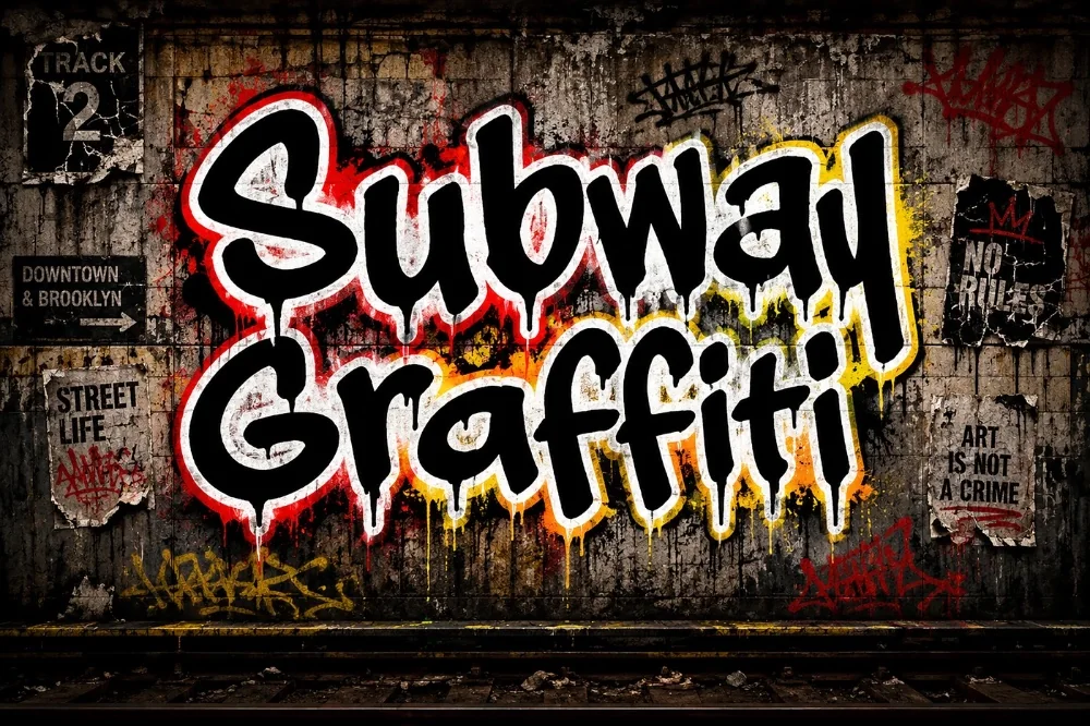
Download this fontAffiliate link
Some links below are affiliate links — a small commission may come back to me at no extra cost to you. More on this.
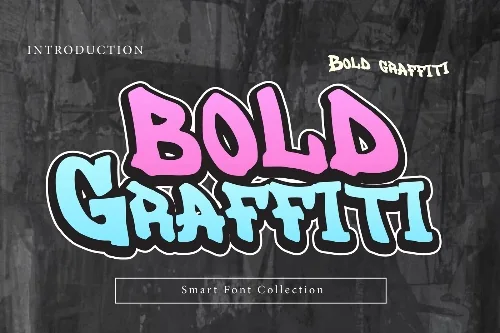
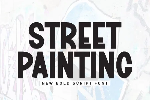
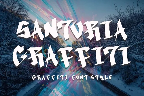
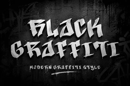
This subway graffiti lettering was picked for the collection because it solves a problem the obvious choices do not. Long, horizontal letterforms shaped by the panels they were painted on. It stretches beautifully across wide headlines and banner artwork.
The characters run wider than they are tall, with flat horizontal spines and short vertical stems. Corners are cut at a slight angle, echoing the way a wide cap paints a straight line across a metal panel.
Ideal for banner images, wide web headers, skate deck graphics, and any layout where you have more width than height to fill.
Installation is the ordinary process: unzip, install the font file, then restart whatever program you plan to use it in. It shows up alongside your existing typefaces with no extra setup. Selling what you make with it is covered by the commercial licence attached to the download. Sharing the file with someone else is not.
Worth knowing: tighten the letter spacing well past what feels comfortable. Painted lettering is set tight, and default digital spacing makes this genre look oddly polite.
Take a look at the full preview before you commit — the extended characters tell you a lot.
Get Subway Car Lettering AlphabetAffiliate link
Your first 10 downloads are free — no payment to start.